They say beauty is on the inside, and while we agree, we can’t help but admit that some easy on the eyes traits can do no harm.
The Dark Theme in Studio is next to take the spotlight, now that we’ve covered some of the exciting new features brought to you by the latest Community Edition release.
Experimental feature in Studio
Right off the bat we should mention that the Dark Theme is experimental. That doesn’t mean we’re not treating it like a bonafide standalone feature, it just means that we’re extra focused on bringing you the best user experience and squashing all of those measly bugs that sometimes surface.
Experimental feature also means that Dark Theme would remain in our immediate attention for about six months, until we’re confident that it meets the utmost exigent standards that all of our products must abide by. Thus, this doesn’t exclude some minor adjustments that might be brought along in the next releases.
Enable Dark Theme
In case you don’t already know, Dark Theme can be enabled from the Studio Backstage View aka the Start menu, under the Settings tab.
Go to the Theme dropdown menu and pick Dark (beta). Studio is painted black only after a restart, it does need a little bit of patience to change its outfit from Classic to Dark, but less than it takes me on a Friday evening.
There you go, now Studio is all dark with a little bit of blue, a darker shade than the one we’ve all gotten accustomed to.

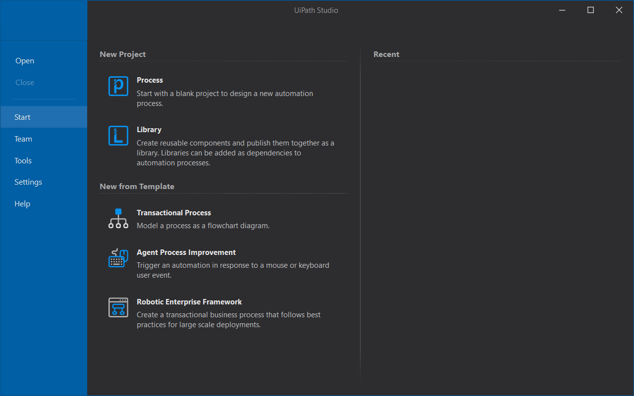
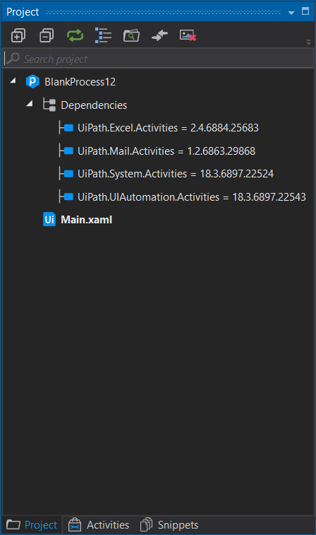
Create a new Blank Project and you’ll see that windows and message boxes have been painted black, while the UiPath logo remains in its now famous white and blue shades.
We’re not going to lie, we did struggle a bit with the Universal Search bar and in fact, most search bars inside Studio, even the Search Activities one. We looked high and low for the most appropriate shade of grey so that the text would still be visible. We really like how it all turned out, but let us know what you think.
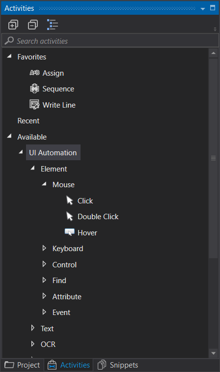
If you’re wondering how the Designer panel looks like in Dark Theme, feast your eyes:

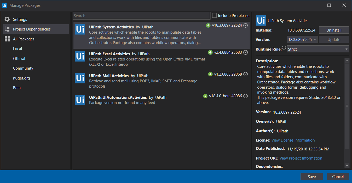
We figured a shade of orange for selected activities would go great with the black and blue colors throughout the whole interface. But wait until you see the Package Manager:
And the Expression Editor:

Did we mention that it keeps its size? Open it, resize it, close it, open it again - boom: it has the same size. It’s the minor tedious things which improve our speed of development. Which pain-point would you like us tackle next?
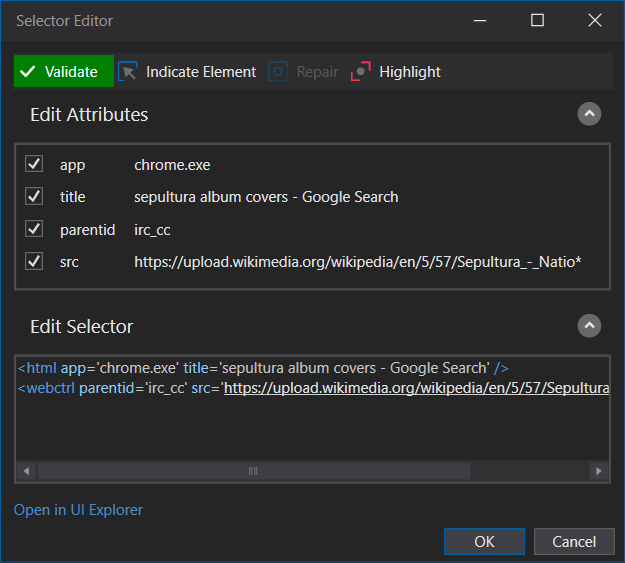
Check out the darker Selector Editor:
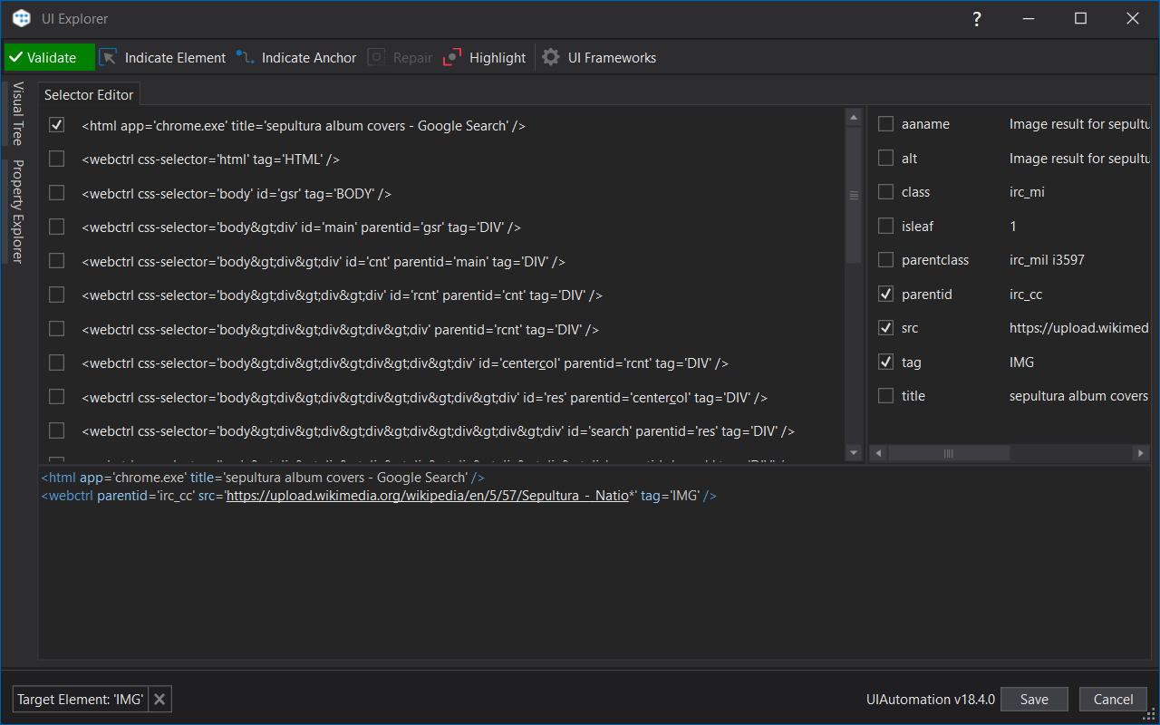
And of course, the UI Explorer:
Now that we’ve bragged enough, it’s time for some good ol’ honesty. We haven’t quite finished working on the dark theme for wizards, while some adjustments must still be made for a few of the activities. It’s also worth mentioning that the Robot doesn’t have a change of Dark clothes yet, it’s in the works so please be patient, we’ll get to it. Until then, make sure to check back here or go over the Studio Guide to get detailed descriptions of all features.
All and all, we hope you enjoy the Dark Theme as much as we do. Needless to say, many here at UiPath haven’t switched back to Classic for a while now.
Let us know what you think in the comments, the whole team is eager to hear your feedback.