UI Path Team, firstly thanks for pushing out a new theme across the Academy site, it looks very clean & modern and definitely brings a much needed UX design improvement, however I have noticed an issue (or a feature that may be intended) that is causing some visibility issues.
When navigating to any of the course’s, the intro template/slide background is now filled as the background at a lowered opacity for all slides/videos for all the content within the course, making it quite hard to see. Is there any way to remove this or lower the opacity further so that the text/information on screen isn’t obstructed?
In the mean time, I’m going to attempt to disable it with uBlock Origin. For videos, the fix is to expand it to full screen, however I don’t feel that should be the only way to remove it.
In addition, when viewing the practice exercises, you can only view the very first slide and it immediately skips to the next slide upon clicking next.
This is a problem for practices that have resource materials, then the problem, then the walkthrough and finally the solution.
In effect, it is now impossible to access Practice exercises.
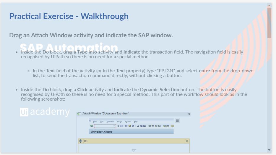
Hmm… Practice exercises are only single slides though and are working fine for me. I’m able to use the navigation area on the right of the screen to see the Outline, then click “Walkthrough”, then “Answers” once complete. Not sure what you mean by unable to navigate through the pages of them?
In particular, the orchestrator course. I cannot see the outline, walkthrough and answers. see the last exercise that requires you download a resource file.