Introducing Apollo design system
Over the past couple of years, we’ve seen the number of products from UiPath grow from 3 to over 20! With this rapid growth, we realized that our customers would benefit from a design system to keep our experiences simple to use and easier to develop.
The Apollo design system is a collection of objects (controls in many cases) that allow us to provide UiPath customers with the best possible experience across all of our products. Guided by clear standards, we assemble these components to create any number of products. We believe that a good design system brings critical value to you.
What will change in Orchestrator?
A new consistent look
Starting with next month, with the adoption of Apollo design language and controls, you will notice changes in how we look. These changes are intentional and done to put focus on functionality while enabling consistent experience across all UiPath products.
Easy access to all products
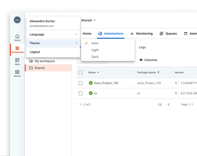
Orchestrator will now be directly accessed from the left navigation. No more accessing Orchestrator only from ‘Home’ and also exiting Orchestrator every time to access other services. With this change, we will also move theme and language controls to left navigation (under profile flyout) and apply them consistently across all services.
Unified, context-aware header
You will see the Tenant name right in the header. This will enable you to be aware of tenant context at all times in Orchestrator (and every other product too). Moreover, if you will work across tenants, you will be able to easily switch as well. Our customers who work with the Development, Testing, Acceptance and Production (DTAP) model should find this immensely useful. Let us know if you like this!
You will be able to set the Tenant colour from ‘Admin’ that shows up for all tenant aware services. This, in addition to the Tenant name, will help you identify the context better.

New and improved Quick Actions
We improved the header Quick Actions in 20.10 to help you be more efficient without the need to go to each individual page for finding what you need. With this release, we have further improved on it by clearly calling out folder-related actions (including folder management) vs creating new entities in the Folder and Tenant sections.
Our approach to making changes is always based on research that listens to you, our customers.
Do share your thoughts and feedback, appreciative or critical, we’ve love to hear them through the UiPath Forum. We are here to make your UiPath experience better and easier.
![]() The new design system does not bring any functional changes and no disruptions are expected with its rollout
The new design system does not bring any functional changes and no disruptions are expected with its rollout
Let us know what you think
Our team has made some amazing improvements and new additions that should bring you value. These changes will be live starting with beginning of May in Cloud Orchestrator.
Lastly, hit ![]() below and let us know what you think.
below and let us know what you think.
Thank you, again, for being a UiPath customer. We appreciate it!
The UiPath Team.


